Making your home a sanctuary can start with something as simple as color. The hues you choose for your walls, furniture, and decor may hold more sway over your comfort than you think. After all, colors can affect our emotions and moods in surprising ways.
The Psychology of Colors
Before diving into which colors to choose, it’s essential to understand the impact that colors have on our emotions. Certain colors evoke specific feelings, while others may have a more individualized or cultural interpretation. Here are some widely accepted color associations:
- Blues – Calmness, stability and serenity
- Greens – Growth, renewal, and balance
- Yellows – Happiness, energy and optimism
- Reds – Passion, energy, and excitement
- Purples – Creativity, relaxation, and luxury
- Neutrals – Simplicity, elegance and warmth
Selecting a Soothing Color Scheme
To create a calming and comforting color scheme, consider the following tips:
- Choose Muted Hues – Select colors with a softer, subdued appearance, such as pastels or diluted versions of more vibrant hues. For instance, pick a softer, muted shade like terracotta or dusty rose instead of bright red.
- Lean on the Cool Side – Cool colors such as blue, green, and purple work best for creating a relaxing atmosphere. Consider blending these colors with neutrals to maintain a balanced palette.
- Opt for Consistency – Maintain a consistent color theme throughout your home to ensure a cohesive and harmonious atmosphere.
Best Areas to Apply Soothing Colors
While calming colors can be applied to any part of your home, specific spaces particularly benefit from the calming influence these shades provide:
- Bedrooms – Serene colors create a relaxing and peaceful environment, promoting rest. Examples include soft blues, pale greens, or muted purples.
- Bathrooms – If you’re planning a bathroom remodeling project, consider picking cool colors like soft blues and pale greens to lend a serene, spa-like feeling to your bathroom, making the space an ideal retreat for relaxation.
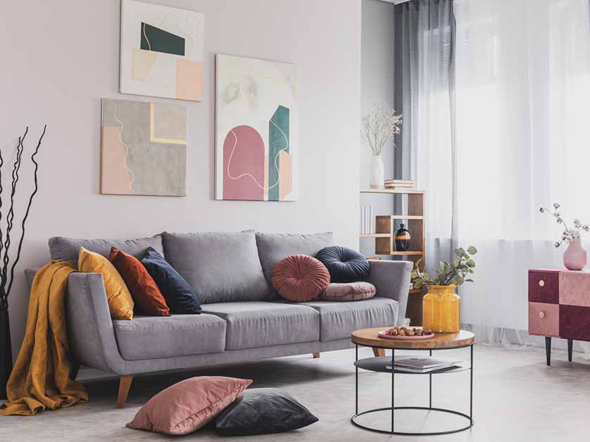
- Living Rooms – Warm neutrals with cool-colored accents contribute to a comfortable and inviting ambiance in common areas like living rooms.
- Home Office – Calming colors like light blues or greens combined with neutrals can help reduce stress and improve focus in your home office.
- Home Additions – Home additions can significantly benefit from soothing colors, whether it’s a sunroom, a reading nook, or a renovated attic. A light, airy blue can make a sunroom feel even more open, while a pale sage green in a reading nook might enhance concentration and calmness.
By carefully selecting soothing colors and applying them in strategic areas throughout your home, you can create an environment that fosters comfort and tranquility for you and your loved ones.
Contact Our Remodeling Experts!
Call G.M. Roth Design Remodeling at (603) 880-3761 to request a consultation. You can also fill out the form on our contact page to get started. We take pride in providing high-quality house additions and remodeling services to homeowners in North Reading, North Andover, Tewksbury, and the surrounding MA areas.


